SCHED App Case Study
Project Overview
The Product:
This scheduling app was created with busy families in mind. Due to busy schedules, many families need a way to keep track of events. Here are examples of the load up page and login page.
March 2024 - May 2024
I want for my family and I to keep up with each other’s appointments and events. It is difficult to remember everything with my own busy schedule.
The Goal
The primary goal for this app is to help families manage busy schedules. With a family scheduling app, we will be able to keep up with each other and help schedule appointments for one another.
My Role
Lead UX designer
UX researcher
Visual Designer
Responsibilities
Conducting interviews, paper and digital wireframing, low and high-fidelity prototyping, conducting usability studies, accounting for accessibility, iterating on designs, determining information architecture, and responsive design.

User Research: Pain Points
1. Syncing Issues
“If the app doesn't sync properly across devices or with other calendar apps, it can lead to confusion and missed appointments.”
2. Limited Accessibility
“If the app is only available on certain platforms or devices, it may exclude some family members from participating in the scheduling process.”
3. Notification Overload
“Too many notifications or reminders can become overwhelming and lead to users ignoring important alerts.”
4. Complexity
“Users may find the app too complicated to use, especially if it has too many features or a cluttered interface.
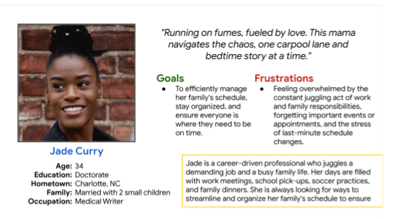
Persona: Jade
Problem Statement:
Jade is a young mother who needs schedule reminders because of her children’s school and sports schedules.
User Journey Map
Mapping Jade’s user journey revealed how helpful it would be for users to have access to a dedicated SCHED’s Family Scheduling.

Wireframes

Paper Wireframes
My goal was to create a homepage where every other page is accessible.
Digital Wireframes
My thoughts or main goal was to create an app where families can keep up and help with not only their own schedules but the schedules of others as well.

My main thought process with the calendar pages was to make each page (daily, weekly, monthly) easily accessible to one another.

Low-fidelity Prototype
User flow goes as follows:
- Each profile picture goes to an individual profile page.
- You can use the arrow button to go back to the homepage.
- By clicking on the mini calendar, it will take you to the monthly calendar page.
- From that page you can either go to the daily or weekly page.
- Also, from the homepage, you can go to reminders or to the new event page.
Usability Study: Findings
This report presents the findings from a usability study conducted on a prototype of the Family Scheduler App. The goal of the study was to evaluate the app's effectiveness in addressing the scheduling needs of families and identify areas for improvement.
1. Confusion with Interface
2. Customization Preferences
3. Ease of Adding and Editing Events
Round 2 Findings
1. Feature Prioritization
2. Communication Needs
3. Integration Challenges
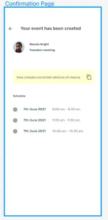
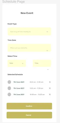
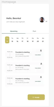
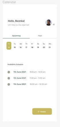
Mockups

Accessibility Features
General Accessibility
Multilingual Support: Offer the app in multiple languages to cater to diverse families.
Text-to-Speech Functionality: Integrate text-to-speech options that can read aloud events, tasks, and reminders.
Clear Documentation: Provide clear and concise in-app tutorials and user guides in accessible formats.
Cognitive Impairments
Simple Interface: Design a clean and uncluttered interface with clear icons and labels.
Predictable Layout: Maintain a consistent layout throughout the app to avoid user confusion.
Customization Options: Offer options to customize calendar views, font sizes, and color schemes based on user preferences.
Focus Assist: Implement a focus mode that minimizes distractions and highlights the current task.
Visual Impairments
Color Contrast: Ensure high color contrast between text & background for clear readability. Follow WCAG (Web Content Accessibility Guidelines) standards.
Screen Reader Compatibility: Make the app fully compatible with screen readers. Events, labels, & buttons should be clearly announced & accessible through keyboard navigation.
Voice Commands: Integrate voice commands for adding events, setting reminders, & navigating the app.
Take Aways

Impact
Family Pain Points: Families struggle with fragmented schedules, communication gaps, and managing to-do lists. This leads to missed appointments, forgotten activities, and overall stress.
User Needs: There's a strong demand for a centralized platform that streamlines family scheduling, communication, and task management. User-friendliness and accessibility are crucial for app adoption within the family unit.
App Opportunities: The app can go beyond basic scheduling by offering features like chore assignment, family chat, location sharing, and tools to promote family bonding. Integration with existing calendars and other family-oriented apps can further enhance the user experience.
Accessibility: Considering visual, hearing, cognitive, and motor impairments is crucial for creating an inclusive app that caters to diverse families.
User Journey: A smooth onboarding process, clear instructions, and in-app incentives can encourage family participation and build user loyalty.
What I Learned
In essence, a successful Family Scheduler App should bridge the communication gap, simplify organization, and ultimately foster a sense of connection within busy households.
Next Steps
Develop user personas based on research findings.
Create prototypes of the app to test with users and gather further feedback.
Refine the app design based on user testing results.